

Closing date for applications
18.05.2021
05.02.2020
The order has been signed, preliminary applications are already being accepted, and very soon, the regional auditions for the Nuclear Kids Project 2020 will begin. In May we will find out the names of the new lucky kids and start preparing documents and packing our suitcases. To bring summer a little closer and to help those who have been thinking about their images for a long time, we decided to tell you about the colors for our uniforms.
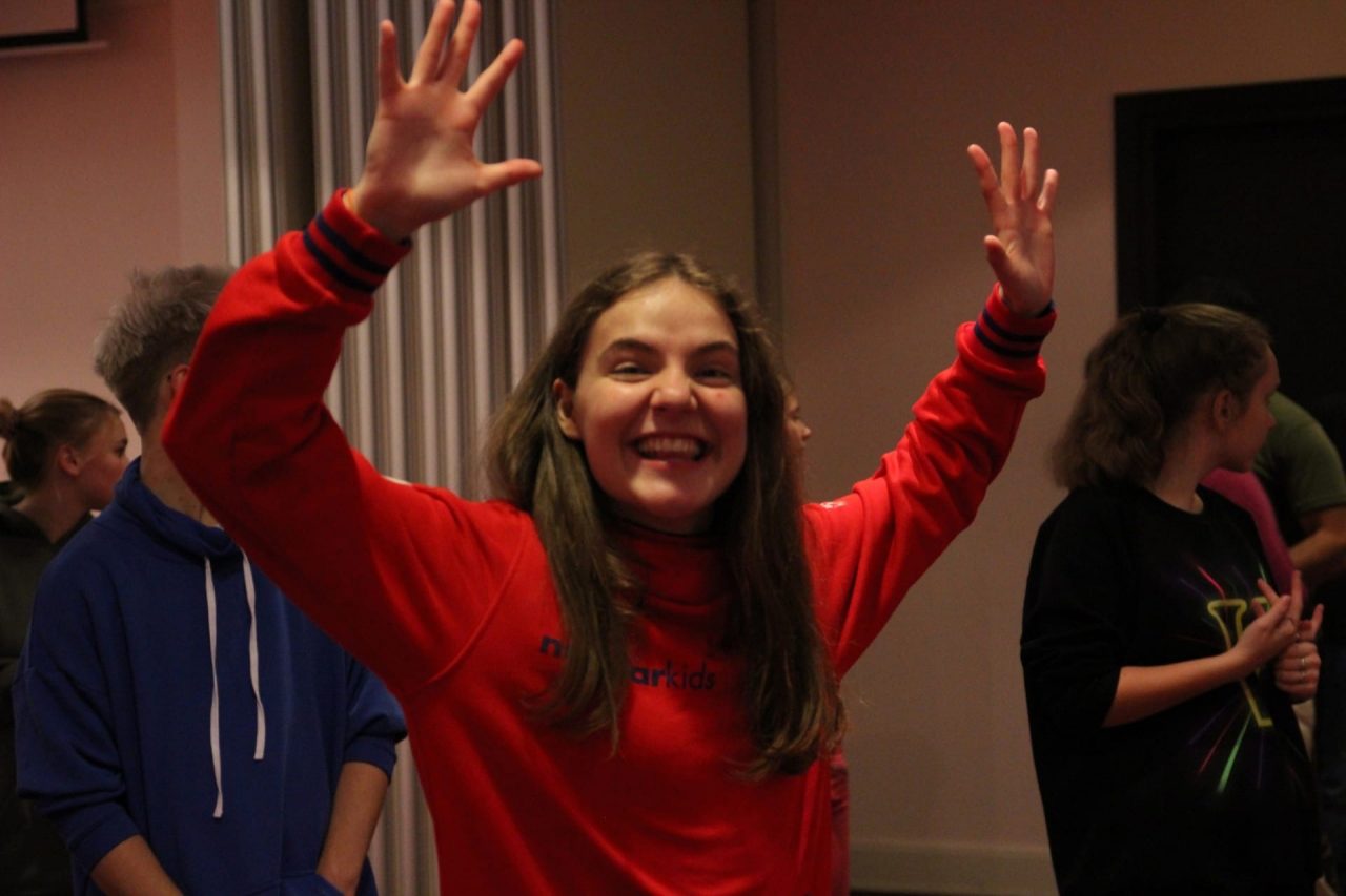
Traditionally, each project participant at the very beginning of the project session receives a starter-pack with various branded items that may come in handy in different circumstances on the project. Such as: towels, portable chargers, notepads with pens, thermal mugs, backpack key chains, caps, t-shirts, sweatshirts, hoodies, raincoats and backpacks. This set is not defined once and for good, except for clothing items, and may change from year to year.
In addition, each year has its own colors. In 2019, it was a combination of orange, yellow and turquoise, in 2018 – purple and neon yellow, in 2017 – pale peach and sky blue.
Sets for girls and boys may differ in colors or combinations on the sleeves or hoods.
Now, in February, we are disclosing the selected colors of the XII Project. They are Classical Blue and Flame Scarlet.
These two colors are distinguished from others by the Pantone Color Institute, which sets color trends for the whole year in all areas of life with its palette.
The sea has inspired the top managers of the company, so in 2020, according to the institute, blue and marine shades will be especially trendy. According to experts, blue color expresses our desire for a sense of the familiar, habitual, close and confident, a friendly and inviting palette that gives us a sense of ease and freedom to be ourselves. So even the simplest denim in all its forms – jackets, pants, shirts and skirts – will undoubtedly help you stay on trend effortlessly.
Besides, blue is the color of hope, serenity and assurance in the future. Versatile to wear and essential in any closet, it is like a starry sky that, with its depth, helps us shade the brightness of the stars.
Pantone called Classical Blue a “timeless blue, elegant in its simplicity,” a reassuring color that “promises to protect you, underlines our desire for a solid ground.”
The most attentive ones might have a question, but what does red have to do with it?
Aggressive, bright, demanding, it doesn’t fit in at all with the soft colors of a serene marina.
Just as there is no single style in modern fashion, the Color Institute doesn’t have a one-size-fits-all trend for the entire year. That’s why the Pantone Institute didn’t limit itself to the sea. The trend for summer is bright, optimistic and life-affirming colors, which in their brightness and saturation are reminiscent of the disco 80s. This is how Pantone decided to reflect our dream of stability and individuality, independence and extraordinariness in summer.
Flame Scarlet is a bright, unstoppable red shade like Scarlet from Gone with the Wind, representing determination, courage and self-confidence. Flame Skarlet boldly declares: here I am, pay attention to me!”
Therefore, marked with these colors, Project 2020 will be warm, bright and full of individuality, yet complemented by stability, self-confidence and comfort.
And most importantly, 2020 marks the 75th anniversary of the nuclear industry and the corporate identity already developed and launched for this memorable date combines these two colors, and also white.
Read about new trends and news in the next article. Keep in touch with Nuckids!
From editorial staff with love